Reworking a Tom Brady Infographic
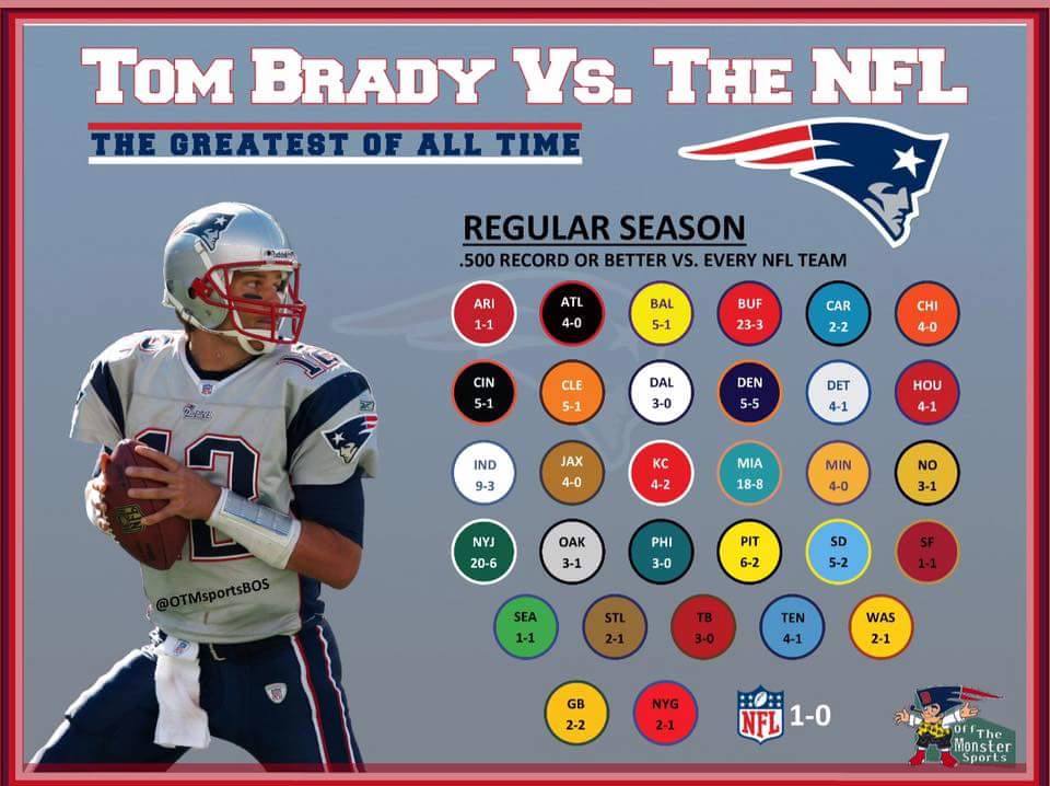
I recently came across this graphic, posted on the New England Patriots Updates Facebook page, in my Facebook News Feed.

While the numbers in the infographic are remarkable—Brady has at least a .500 career record against every team in the NFL—I thought that the design of the graphic could be improved upon. Namely, it is difficult to draw comparisons among Brady’s opponents because:
- Each opposing team has its own distinct circle; reading and comparing text in 31 circles can get overwhelming.
- There is no particular ordering of the circles. Though it is nearly alphabetical, for some reason GB and NYG are placed at the end of the list.
- As Kaiser Fung of Junk Charts would say, the chart is of the “bring your own calculator” variety. In other words, the reader needs to perform some calculations to draw conclusions from the chart. For example, a curious reader could not immediately determine whether Brady has a better winning percentage against the Jets (NYJ) or the Chargers (SD). To do so requires comparing $\frac{20}{26}$ to $\frac{5}{7}$ (which turns out to be about 76.9% to 71.4%).
Below, I have reproduced this chart, using Plotly, a Python graphing library, in a way that I believe allows for easier interpretation, especially in regard to comparisons. Here, I chose to order the observations based on games played.
import pandas as pd
import plotly.plotly as py
from plotly.graph_objs import *
import numpy as np
%matplotlib inline
df = pd.DataFrame()
df['Team'] = ['ARI', 'ATL', 'BAL', 'BUF', 'CAR', 'CHI', 'CIN', 'CLE', 'DAL', 'DEN', 'DET', 'HOU', 'IND', 'JAX',
'KC', 'MIA', 'MIN',	'NO', 'NYJ', 'OAK', 'PHI', 'PIT', 'SD', 'SF', 'SEA', 'STL', 'TB', 'TEN', 'WAS', 'GB', 'NYG']
df['W'] = [1, 4, 5, 23, 2, 4, 5, 5, 3, 5, 4, 4, 9, 4, 4, 18, 4, 3, 20, 3, 3, 6, 5, 1, 1, 2, 3, 4, 2, 2, 2]
df['L'] = [1, 0, 1, 3, 2, 0, 1, 1, 0, 5, 1, 1, 3, 0, 2, 8, 0, 1, 6, 1, 0, 2, 2, 1, 1, 1, 0, 1, 1, 2, 1]
df['Games'] = df['W'] + df['L']
df['WP'] = df['W']/df['Games']
df = df.sort_values(by='Games')
text = df['WP']

trace1 = Bar(
        x=df['W'],
        y=df['Team'],
        orientation = 'h',
        name = 'Wins',
        marker = Marker(
            color = 'rgb(70,130,180)'
        ),
        opacity = .5,
    )

trace2 = Bar(
        x=df['L'],
        y=df['Team'],
        orientation = 'h',
        name = 'Losses',
        marker = Marker(
        color = 'red'
        ),
        opacity=.5
    )

data=Data([trace1, trace2])
layout = dict(
    title='Tom Brady vs. Every Team in the NFL (Reg. Season)',
    barmode='stack',
    height = 800,
    showlegend=False,
    xaxis=XAxis(title='Games'),
    plot_bgcolor='ECE6E6'
)


annotations = []

for i in range(0, len(df['L'])):
    annotations.append(Annotation(x=df['L'][i] + df['W'][i] + 2, y=df['Team'][i],
                                  text=str(np.round(text[i]*100, 1))+'%',
                                  font=Font(family='Arial', size=14),
                                  showarrow=False))
    annotations.append(Annotation(x=df['W'][15] - 8, y=df['Team'][15],
                                  text='Wins',
                                  font=Font(family='Arial', size=14),
                                  showarrow=False))
    annotations.append(Annotation(x=df['L'][15] + 14, y=df['Team'][15],
                                  text='Losses',
                                  font=Font(family='Arial', size=14),
                                  showarrow=False))
    layout['annotations'] = annotations

fig=Figure(data=data, layout=layout)

py.iplot(fig, filename='brady_bar')
