The Field of 68
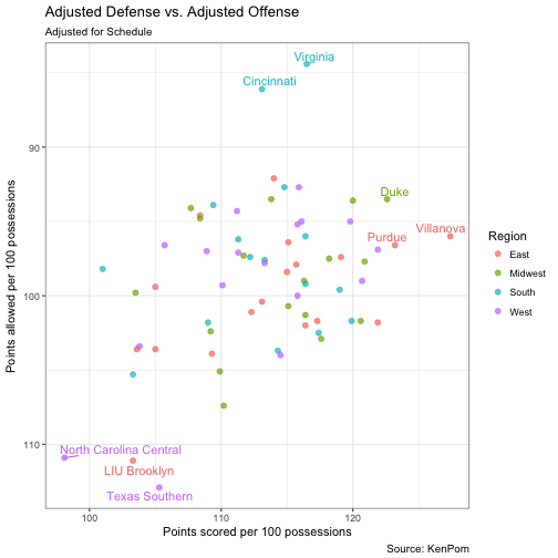
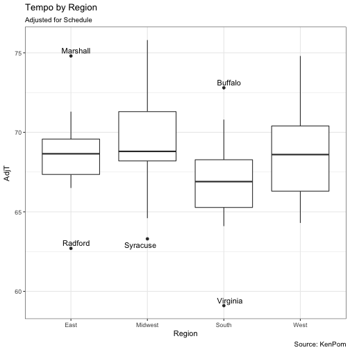
Here are two plots to consider for this year’s NCAA tournament. I use data for the 68 teams featured in the bracket.
library(ggplot2)
library(RCurl)
library(ggrepel)
library(dplyr)

df = read.csv(text=getURL("https://raw.githubusercontent.com/jskaza/data/master/ncaa2018/seeds2018.csv"))

ggplot(data=df, aes(x=AdjO, y=AdjD, color = Region)) +
  geom_point(size=2, alpha=0.7) +  scale_y_reverse() + xlab("Points scored per 100 possessions") +
  ylab("Points allowed per 100 possessions") +
  theme_bw(base_size = 18) +
  geom_text_repel(aes(label=ifelse(AdjD<90 | AdjO > 122 | AdjD > 110 ,as.character(Team),"")), show.legend = FALSE) +
  labs(title = "Adjusted Defense vs. Adjusted Offense", subtitle = "Adjusted for Schedule", caption = "Source: KenPom")

is_outlier = function(x) {
  return(x < quantile(x, 0.25) - 1.5 * IQR(x) | x > quantile(x, 0.75) + 1.5 * IQR(x))
}
df2 = df  %>% group_by(Region) %>%
  mutate(outlier=ifelse(is_outlier(AdjT), as.character(Team), ""))
ggplot(data=df2, aes(x=Region,y=AdjT)) +
  geom_boxplot() +
  geom_text_repel(aes(label=outlier),na.rm=TRUE) +
  labs(title = "Tempo by Region", subtitle = "Adjusted for Schedule", caption = "Source: KenPom") +
  theme_bw(base_size=18)

