The Economics of Shot Distribution
In basketball, we often hear that certain players need to get their fair share of shots during the game. Karl-Anthony Towns was criticized for his lack of shot attempts in a playoff game versus Houston this year. In that game, Towns took nine shots compared to 14 from Derrick Rose and 11 from Jamal Crawford. This distribution seems opposite of what it should be. Ideally, your best players should take a relatively larger proportion of the shots. For one, they should be on the floor more and therefore have more chances. Additionally, even controlling for playing time, the more skilled player should take more shots.
Here, I am going to take a deep dive into shot distribution among NBA teams and set out to answer the following question:
Which teams have the most/least equitable distribution of field goal attempts (FGA)?
The idea of inequality arises quite a bit in society, particularly in relation to the economy. A central tenet of the Occupy movement is to attack social and economic inequality. A recent paper by economist Edward N. Wolff estimates that the wealthiest one percent of American households hold 40 percent of the nation’s wealth. Econometric theory provides us with a toolkit to analyze inequality empirically. Here, I will use two ideas from the economic literature to examine the equality (or lack thereof) of FGA among teams: the Lorenz curve and the Gini coefficient.
The Lorenz curve is a graph that depicts the proportion of $y$ held by the bottom $x\%$ of people. Perfect equality is represented by the line $y=x$. That is, the bottom 20% of the population owns 20% of the wealth, the bottom 60% of the population holds 60% of the wealth, and so on. The Gini coefficient can be derived using the Lorenz curve. The Gini coefficient is the ratio of the area between the line of perfect equality and the observed Lorenz curve to the total area beneath the line of perfect equality.
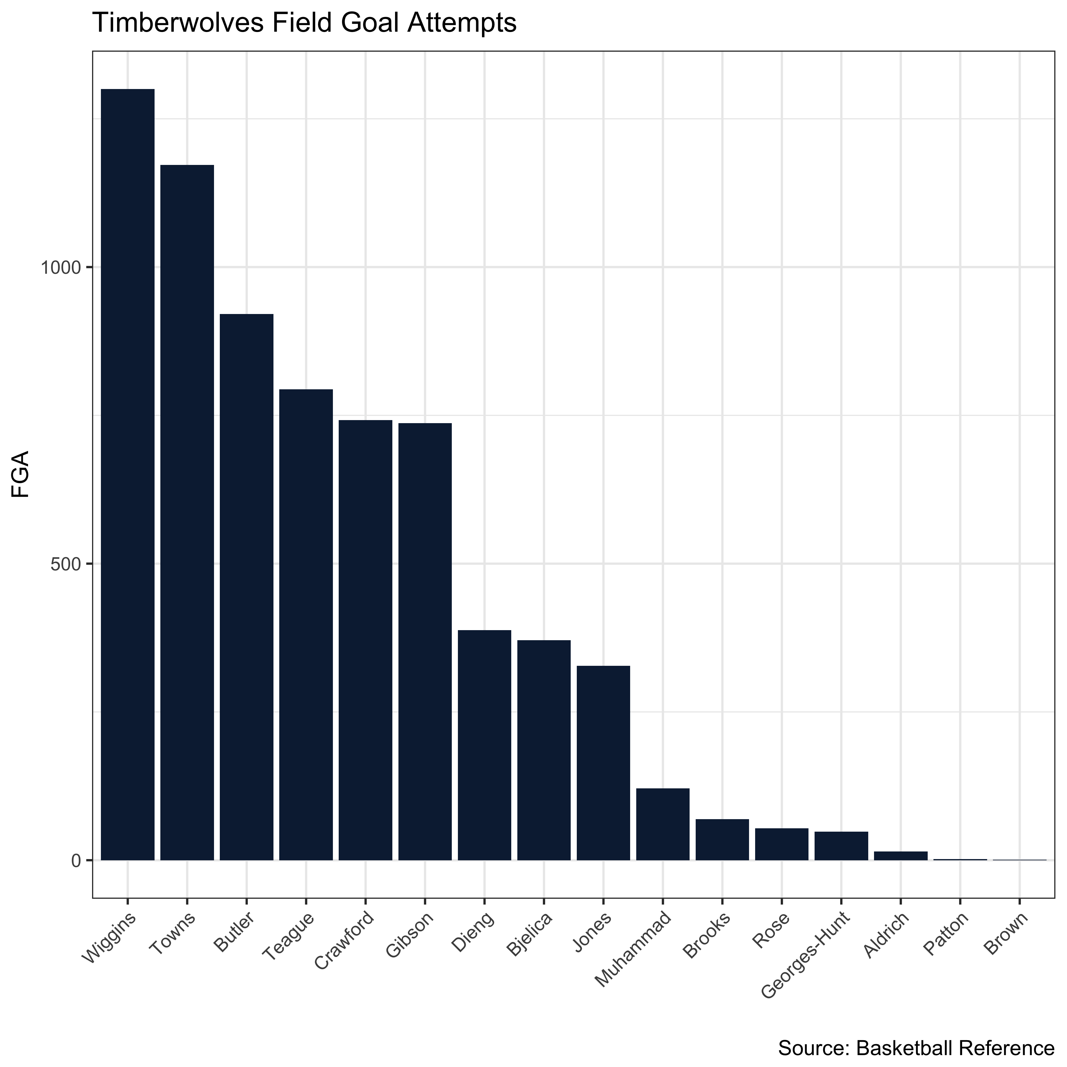
Let’s use the shot distribution of the Timberwolves to illustrate how these concepts can be used to examine the distribution of FGA.
library(RCurl)
library(ggplot2)
library(dplyr)
library(ineq)
library(tidyr)
library(stringr)
library(knitr)
library(ggrepel)
df = read.csv(text=getURL("https://raw.githubusercontent.com/jskaza/data/master/shot-distribution/nba_totals.csv"))
df %>%
  filter(Team == 'MIN') %>%
  mutate(Last = str_extract(Player, "[^ ]+$")) %>%
  ggplot(aes(x=reorder(Last,-FGA), y=FGA)) + geom_bar(stat='identity', fill="#0C2340") + xlab("") +  labs(title = "Timberwolves Field Goal Attempts",
       caption = "Source: Basketball Reference", x = "", y = "FGA") +  theme_bw() + theme(axis.text.x=element_text(angle=45, hjust=1))
df %>%
  filter(Team == 'MIN') %>%
  do(p=Lc(.$FGA)$p, L=Lc(.$FGA)$L) %>%
  unnest(p,L) %>%
  ggplot(aes(x=100*p, y=100*L)) + geom_line() +
  geom_segment(aes(x = 0, y = 0, xend = 100, yend = 100)) +
  geom_polygon(alpha=0.3,fill="#78BE20") +
  labs(title = "Timberwolves Lorenz Curve",
       caption = "Source: Basketball Reference", x = "Cumulative % of Team", y = "Cumulative % of FGA") +
  geom_area(fill = "#0C2340", alpha = 0.3) + theme_bw()
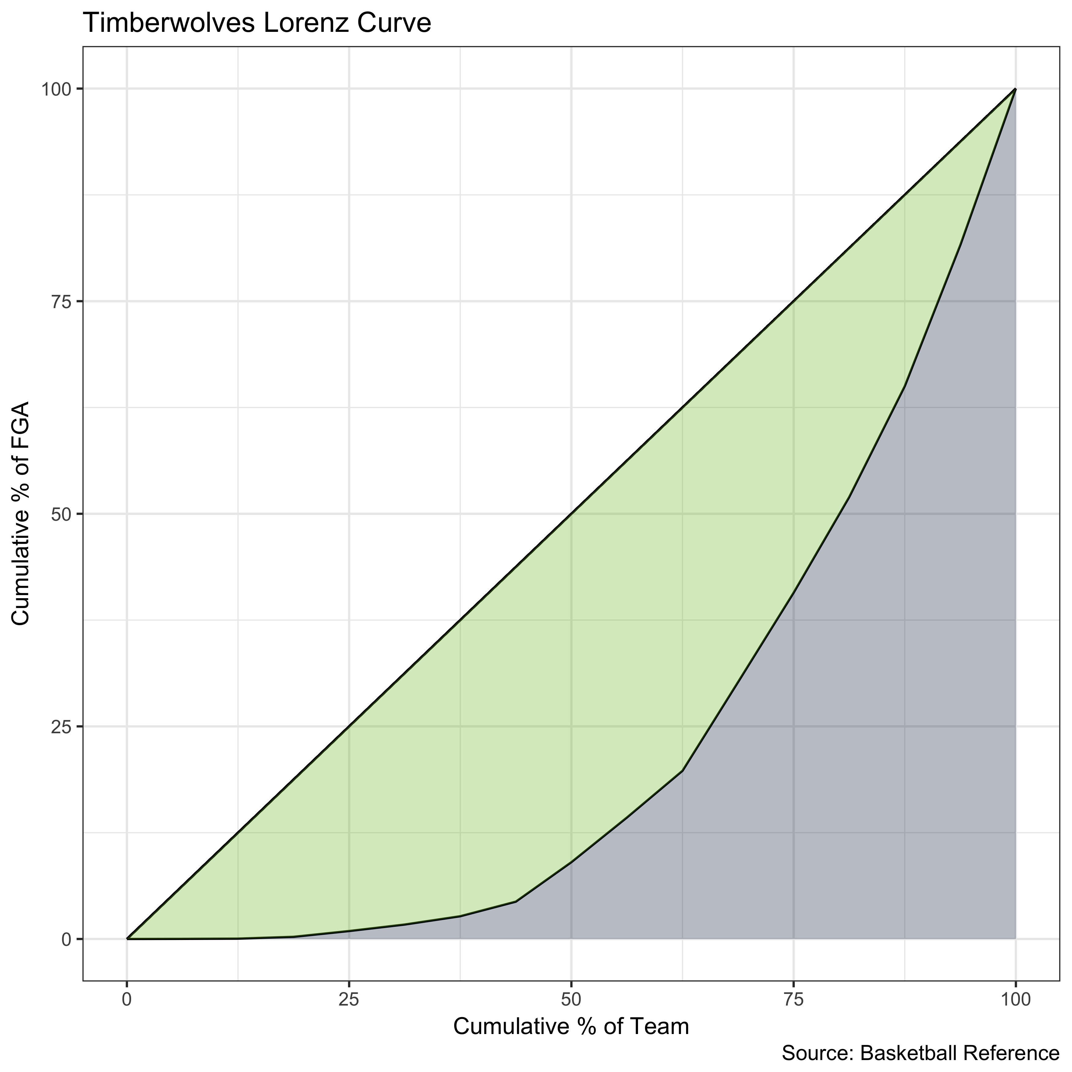
Had the Timberwolves distributed their shots perfectly evenly, their Lorenz curve would fall along the reference line. However, due to inequality in field goal attempts, there is an area (shaded in green) between their Lorenz curve and the line of equality. The size of this area relative to the total area beneath the line of equality lends us the Timberwolves Gini coefficient, which is 0.534.
Now, let’s look at the Gini coefficients and Lorenz curves for all teams.
gini = df %>%
  group_by(Team) %>%
  summarize(Gini = round(ineq(FGA), 3)) %>%
  arrange(desc(Gini))
kable(gini)
| Team | Gini |
|---|---|
| HOU | 0.652 |
| NOP | 0.644 |
| MIL | 0.638 |
| DAL | 0.597 |
| OKC | 0.594 |
| LAL | 0.588 |
| PHI | 0.586 |
| IND | 0.557 |
| UTA | 0.551 |
| BOS | 0.538 |
| POR | 0.537 |
| MIN | 0.534 |
| PHO | 0.521 |
| TOR | 0.517 |
| BRK | 0.515 |
| DEN | 0.514 |
| MEM | 0.508 |
| ATL | 0.503 |
| MIA | 0.499 |
| CLE | 0.498 |
| CHA | 0.485 |
| DET | 0.485 |
| NYK | 0.477 |
| LAC | 0.468 |
| CHI | 0.463 |
| WAS | 0.448 |
| GSW | 0.438 |
| ORL | 0.431 |
| SAC | 0.430 |
| SAS | 0.413 |
lorenz = df %>%
  group_by(Team) %>%
  do(p=Lc(.$FGA)$p, L=Lc(.$FGA)$L) %>%
  unnest(p,L)

lorenz_gini = left_join(lorenz, gini, by = 'Team')

lorenz_gini$Team = factor(lorenz_gini$Team, levels=unique(lorenz_gini$Team[order(-lorenz_gini$Gini)]), ordered=TRUE)

ggplot(data = lorenz_gini, aes(x=100*p, y=100*L, group = Team)) + geom_line(col='blue') +
  geom_segment(aes(x = 0, y = 0, xend = 100, yend = 100)) + theme_bw() + labs(title = "NBA Lorenz Curves",
       caption = "Source: Basketball Reference", x = "Cumulative % of Team", y = "Cumulative % of FGA") + facet_wrap(~Team)
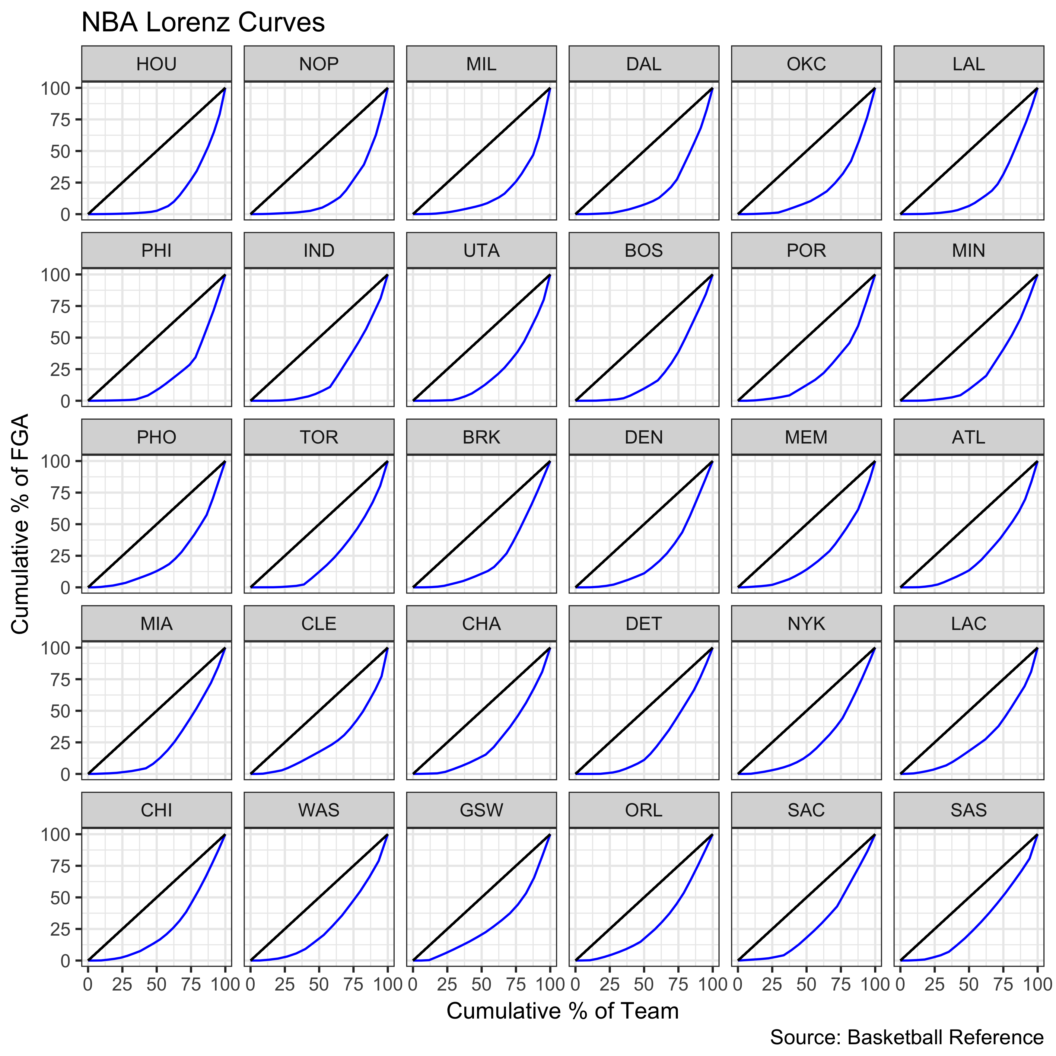
The Houston Rockets–the best team in the NBA this year–had the highest Gini coefficient in the league. In other words, they had the most unequal shot distribution in the league. This is partially attributable to the fact that Houston had 24 players attempt a field goal this year, tied for most in the league.
kable(head(df %>%
  group_by(Team) %>%
  summarize(Players = n()) %>%
  arrange(desc(Players))))
| Team | Players |
|---|---|
| HOU | 24 |
| LAL | 24 |
| MEM | 24 |
| MIL | 24 |
| DAL | 23 |
| NOP | 23 |
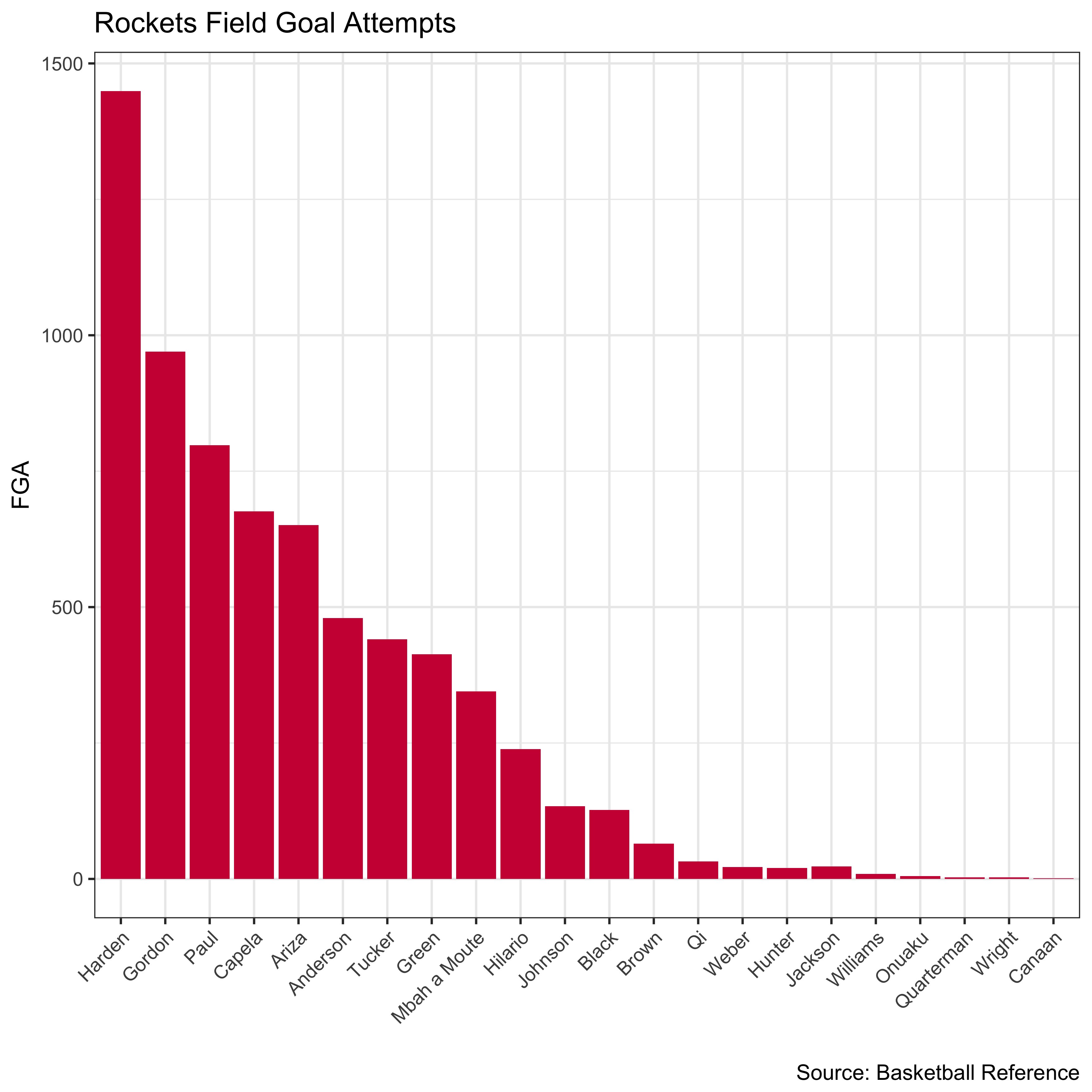
This artificially inflates Houston’s Gini coefficient because they had relatively more “fringe” or “replacement” players play than other teams. Here is Houston’s shot distribution chart, in which we can see a prolonged tail.
df %>%
  filter(Team == 'HOU') %>%
  mutate(Last = str_extract(Player, "[^ ]+$")) %>%
  mutate(Last = if_else(Last == 'Moute', 'Mbah a Moute', Last)) %>%
  ggplot(aes(x=reorder(Last,-FGA), y=FGA)) + geom_bar(stat='identity', fill="#CE1141") + xlab("") +  labs(title = "Rockets Field Goal Attempts",
       caption = "Source: Basketball Reference", x = "", y = "FGA") +  theme_bw() + theme(axis.text.x=element_text(angle=45, hjust=1))
To address this issue, we can restrict our analysis to players who played in at least half of their team’s games (41) and repeat our analysis.
gini2 = df %>%
  group_by(Team) %>%
  filter(G > 40) %>%
  summarize(Gini = round(ineq(FGA), 3)) %>%
  arrange(desc(Gini))
kable(gini2)
| Team | Gini |
|---|---|
| OKC | 0.405 |
| GSW | 0.370 |
| MIL | 0.370 |
| CLE | 0.369 |
| UTA | 0.358 |
| NOP | 0.356 |
| POR | 0.332 |
| LAC | 0.323 |
| HOU | 0.321 |
| MIN | 0.311 |
| LAL | 0.308 |
| CHA | 0.303 |
| PHO | 0.303 |
| BOS | 0.302 |
| WAS | 0.296 |
| TOR | 0.294 |
| DAL | 0.287 |
| ORL | 0.285 |
| ATL | 0.274 |
| PHI | 0.273 |
| DEN | 0.268 |
| SAS | 0.266 |
| IND | 0.258 |
| NYK | 0.251 |
| MEM | 0.250 |
| DET | 0.212 |
| SAC | 0.211 |
| CHI | 0.210 |
| BRK | 0.178 |
| MIA | 0.165 |
lorenz2 = df %>%
  group_by(Team) %>%
    filter(G > 40) %>%
  do(p=Lc(.$FGA)$p, L=Lc(.$FGA)$L) %>%
  unnest(p,L)

lorenz_gini2 = left_join(lorenz2, gini2, by = 'Team')

lorenz_gini2$Team = factor(lorenz_gini2$Team, levels=unique(lorenz_gini2$Team[order(-lorenz_gini2$Gini)]), ordered=TRUE)

ggplot(data = lorenz_gini2, aes(x=100*p, y=100*L, group = Team)) + geom_line(col='blue') +
  geom_segment(aes(x = 0, y = 0, xend = 100, yend = 100)) + theme_bw() + labs(title = "NBA Lorenz Curves",
       caption = "Source: Basketball Reference", x = "Cumulative % of Team", y = "Cumulative % of FGA", subtitle = "Min. 41 GP") + facet_wrap(~Team)
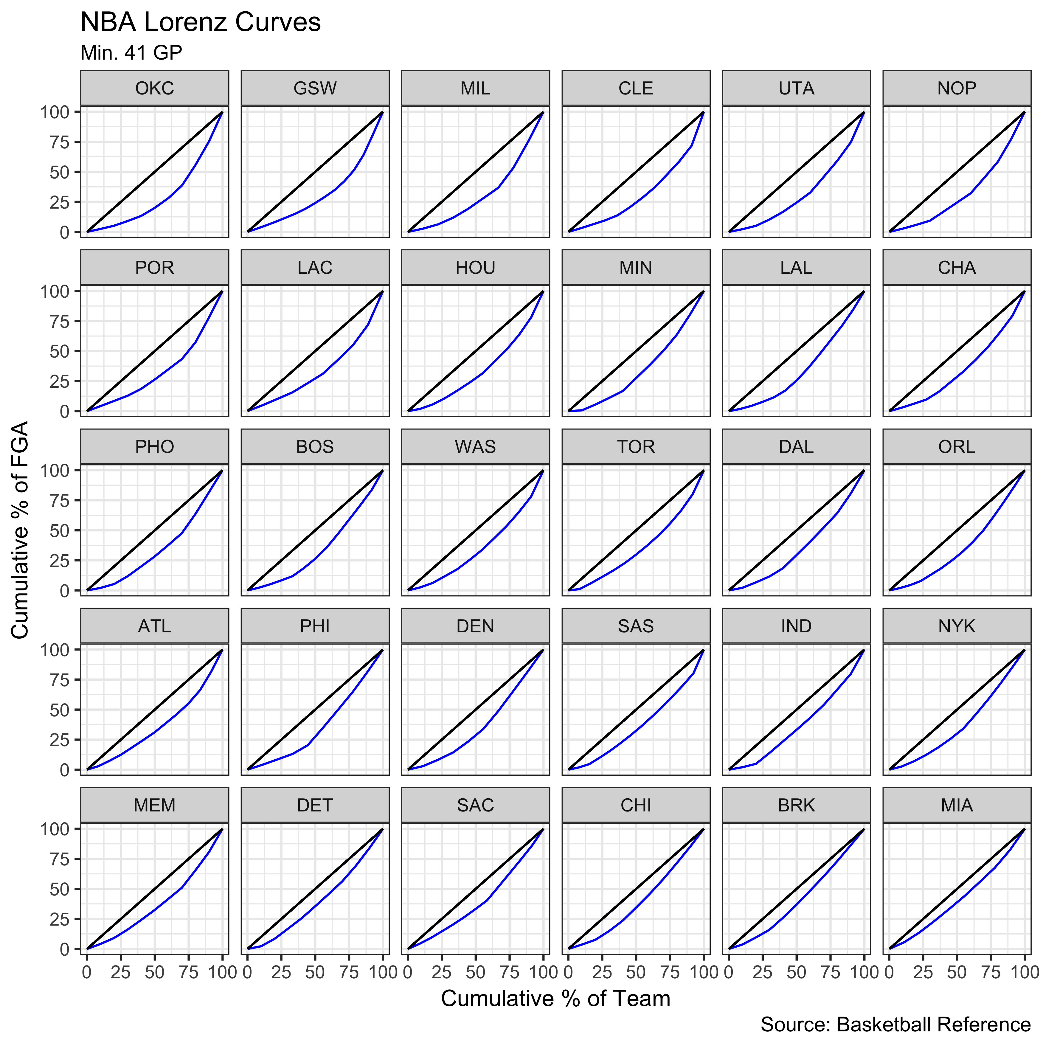
OKC and their big three now become the team with the least equitable shot distribution. We can visualize how the Gini coefficients shift after implementing the minimum games requirement.
gini3 = left_join(gini, gini2, by = 'Team')
p = ggplot(gini3) + geom_segment(aes(x=1,xend=2,y=Gini.x,yend=Gini.y),size=.75, alpha=0.4) +
  theme_classic() + geom_vline(xintercept=1, linetype="dashed", size=.1) +
                  geom_vline(xintercept=2, linetype="dashed", size=.1) + labs(x="", y="Gini Coefficient") +  xlim(.9, 2.1) + ylim(.1,1.1*((max(gini3$Gini.x, gini3$Gini.y))))
# Add texts
p = p + geom_text(label=gini3$Team, y=gini3$Gini.x, x=rep(1, NROW(gini3)), hjust=1.1, size=3.5, alpha=0.3)
p = p + geom_text(label=gini3$Team, y=gini3$Gini.y, x=rep(2, NROW(gini3)), hjust=-0.1, size=3.5, alpha=0.3)
p = p + geom_text(label="No Adjustment", x=1, y=1.1*(max(gini3$Gini.x, gini3$Gini.y)), hjust=-.1, size=3)
p = p + geom_text(label="Adjustment", x=2, y=1.1*(max(gini3$Gini.x, gini3$Gini.y)), hjust=-0.1, size=3)
p + theme(panel.background = element_blank(),
           panel.grid = element_blank(),
           axis.ticks = element_blank(),
           axis.text.x = element_blank(),
           panel.border = element_blank())
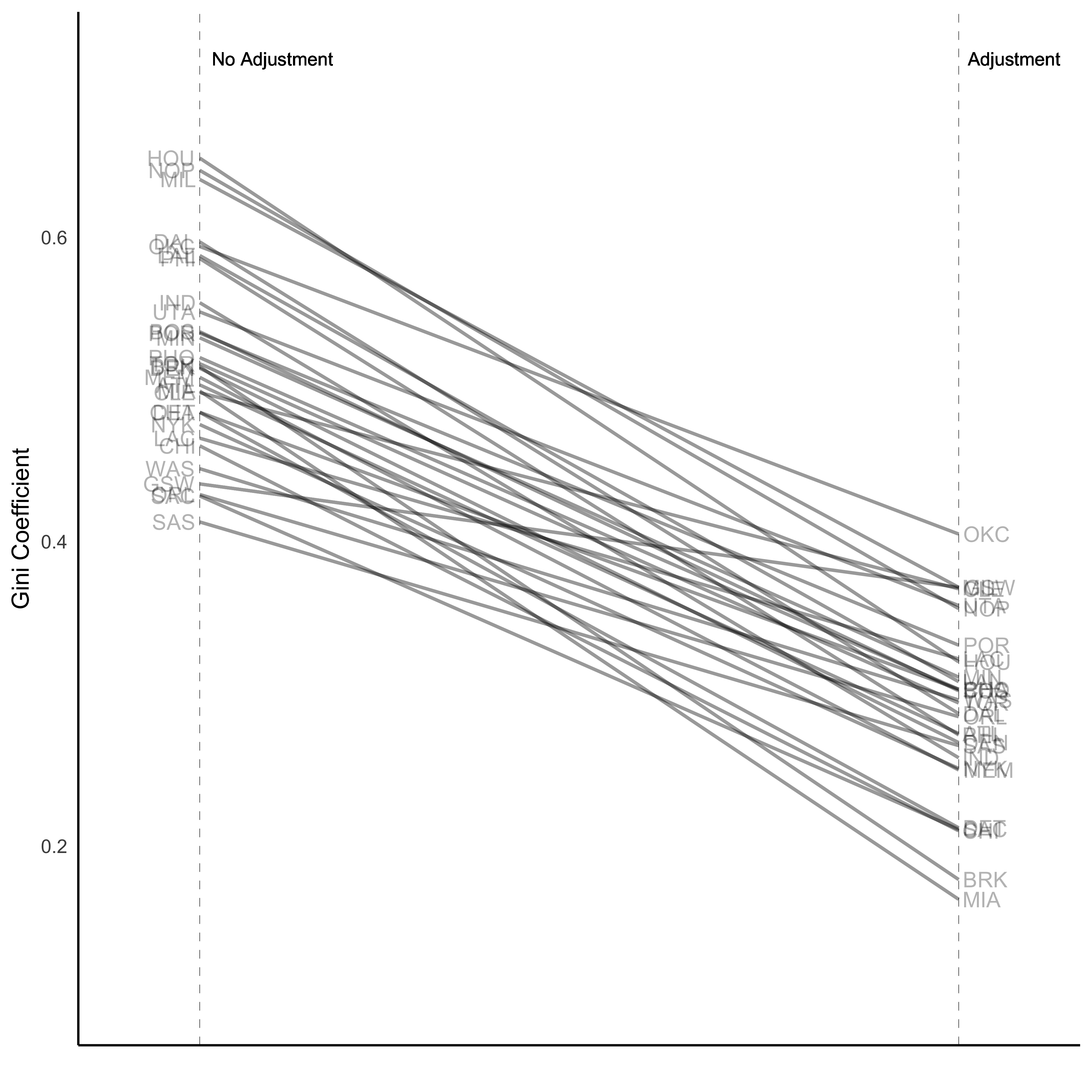
All Gini coefficients decrease after the adjustment because we remove the “replacement” players who were artificially inflating teams’ inequality.
We can add one more layer of adjustment. Looking at Houston, James Harden played in 72 games this season compared to 58 by Chris Paul and 74 by Clint Capela. This creates a problem because our population changes throughout the course of the season. We would expect James Harden to take more shots than Chris Paul not only because he is a better scorer but also because he appeared in more games. A natural idea would be to extrapolate FGA so that each player plays in a hypothetical 82 game season. However, this creates a double-counting situation. Because Chris Paul missed 24 games, fringe players such as Tim Quarterman were credited with FGA that would not have occurred had Paul been in the lineup. In other words, it does not make sense to extrapolate FGA for Chris Paul and Tim Quarterman because Tim Quarterman would probably have 0 FGA if Chris Paul were healthy the entire year.
To create a finite population which will allow for extrapolation, we limit the analysis to players on the opening day roster and extrapolate their FGA.
open = read.csv(text=getURL("https://raw.githubusercontent.com/jskaza/data/master/shot-distribution/opening_day.csv"))
df2 = left_join(open, df, by = c('Team','Player'))
df2$FGA82 = df2$FGA/df2$G*82
gini3 = df2 %>%
  group_by(Team) %>%
  summarize(Gini = round(ineq(FGA82), 3)) %>%
  arrange(desc(Gini))
kable(gini3)
| Team | Gini |
|---|---|
| OKC | 0.451 |
| NOP | 0.418 |
| POR | 0.399 |
| HOU | 0.395 |
| MIN | 0.393 |
| MIL | 0.386 |
| GSW | 0.365 |
| WAS | 0.356 |
| LAC | 0.345 |
| NYK | 0.344 |
| BOS | 0.334 |
| PHO | 0.332 |
| IND | 0.322 |
| DAL | 0.317 |
| TOR | 0.317 |
| CHA | 0.316 |
| LAL | 0.315 |
| UTA | 0.315 |
| PHI | 0.306 |
| CLE | 0.294 |
| DEN | 0.288 |
| SAS | 0.285 |
| DET | 0.282 |
| MIA | 0.282 |
| CHI | 0.281 |
| MEM | 0.258 |
| ATL | 0.247 |
| ORL | 0.245 |
| SAC | 0.229 |
| BRK | 0.195 |
lorenz3 = df2 %>%
  group_by(Team) %>%
  do(p=Lc(.$FGA82)$p, L=Lc(.$FGA82)$L) %>%
  unnest(p,L)

lorenz_gini3 = left_join(lorenz3, gini3, by = 'Team')

lorenz_gini3$Team = factor(lorenz_gini3$Team, levels=unique(lorenz_gini3$Team[order(-lorenz_gini3$Gini)]), ordered=TRUE)

ggplot(data = lorenz_gini3, aes(x=100*p, y=100*L, group = Team)) + geom_line(col='blue') +
  geom_segment(aes(x = 0, y = 0, xend = 100, yend = 100)) + theme_bw() + labs(title = "NBA Lorenz Curves",
       caption = "Source: Basketball Reference", x = "Cumulative % of Team", y = "Cumulative % of FGA", subtitle = "82 Game Extrapolation") + facet_wrap(~Team)
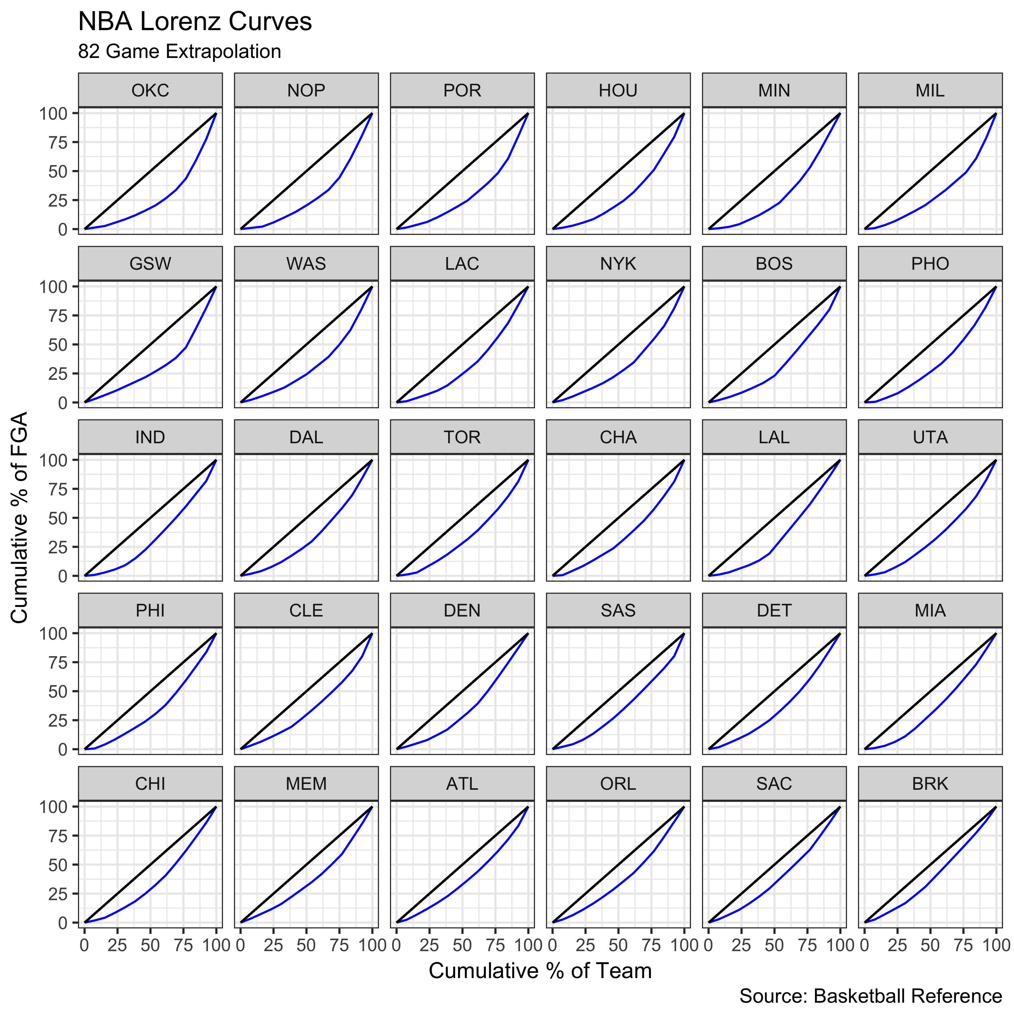
Again, OKC emerges as the team with the least equitable shot distribution.
We have seen that the rankings based on the Gini coefficient can be influenced by the tails of the distribution. Therefore, we can look at a “crude”” estimate of inequality that entirely eliminates the tails. Namely, we can examine the percent of team FGA held by the top $n$ players (a “poor man’s” Lorenz curve). Let’s arbitrarily examine $n = 1,2,\dots,7$.
cumfga = data.frame(Team=character(),
                    cum_fga = numeric(),
                    n = integer())
for (i in 1:7){
temp =  data.frame(df %>%
  arrange(desc(FGA)) %>%
  group_by(Team) %>%
  mutate(cum_fga = cumsum(FGA)/sum(FGA)) %>%
  filter(row_number()==i) %>%
  select(Team, cum_fga) %>%
  arrange(desc(cum_fga)))
temp$n = i
cumfga = rbind(cumfga, temp)
}

cumfga = cumfga %>%
  mutate(label = if_else(n == 4 & (Team == 'OKC' | Team =='DET'), as.character(cumfga$Team), NA_character_))

ggplot(data = cumfga, aes(x = n, y=100*cum_fga, group = Team)) + geom_line(alpha=0.4) + theme_bw() + scale_x_continuous(breaks=seq(1,7,by=1)) + labs(title = "Cumulative % of FGA by Top n Players",
       caption = "Source: Basketball Reference", x = "Top n Players", y = "Cumulative % of FGA") + geom_label_repel(aes(label = label), na.rm = TRUE)
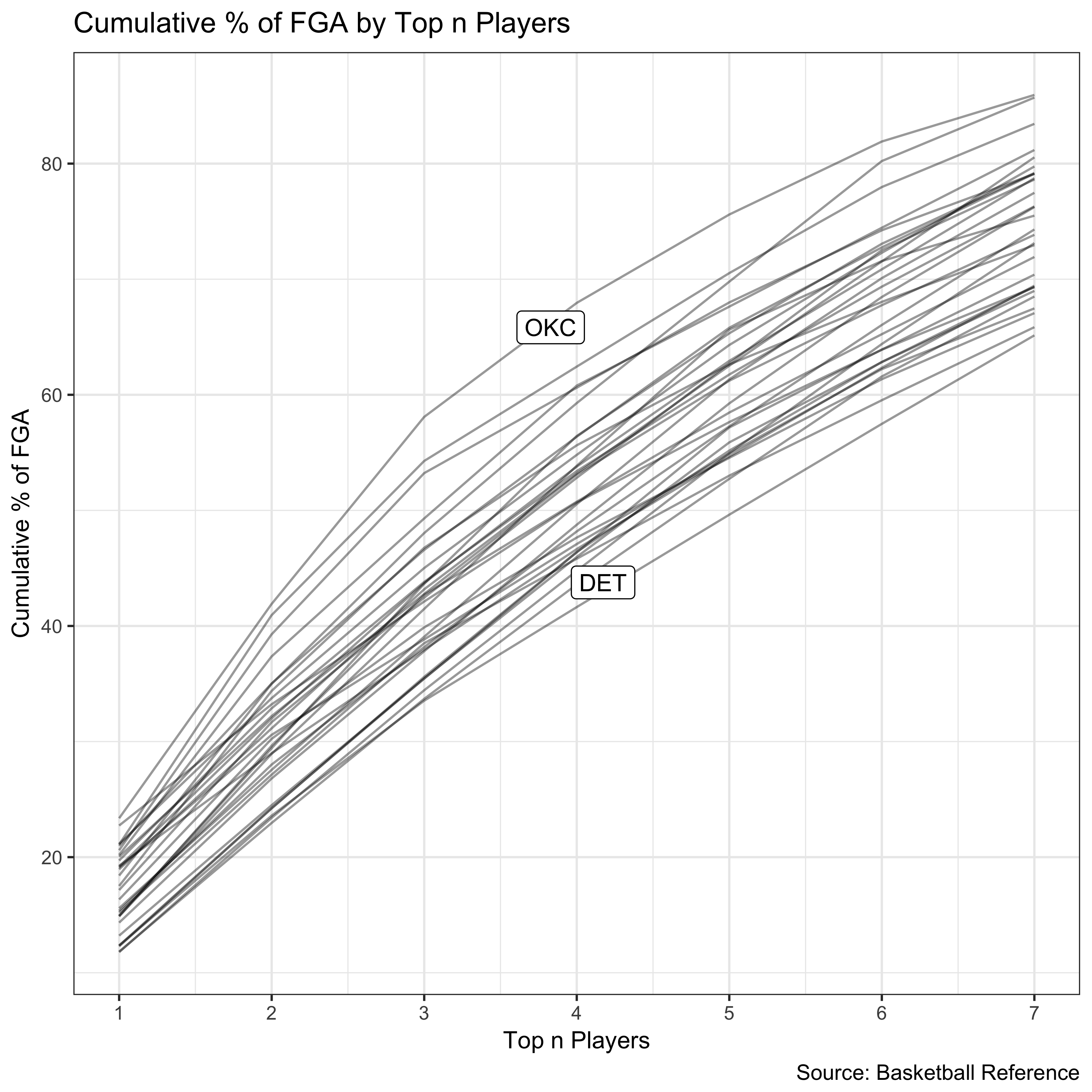
The OKC curve sits above the rest, indicating a shot distribution biased toward the stars.
We have seen four ways to quantify the equity of shot distribution:
- Unadjusted Gini coefficient
- SAS most equitable
- HOU least equitable
- Gini coefficient with a minimum games requirement
- MIA most equitable
- OKC least equitable
- Gini coefficient with 82 game extrapolation
- BRK most equitable
- OKC least equitable
- Cumulative shots by top $n$ players
- DET most equitable
- OKC least equitable
Interestingly, each analysis lends us a different answer to the question of which team has the most equitable shot distribution. However, we do have some signal regarding the least equitable team. That title goes to the OKC Thunder. Their big three account for 58.1 percent of the team’s total shot attempts. Here is the shot distribution for the Thunder.
df %>%
  filter(Team == 'OKC') %>%
  mutate(Last = str_extract(Player, "[^ ]+$")) %>%
  ggplot(aes(x=reorder(Last,-FGA), y=FGA)) + geom_bar(stat='identity', fill="#007AC1") + xlab("") +  labs(title = "Thunder Field Goal Attempts",
       caption = "Source: Basketball Reference", x = "", y = "FGA") +  theme_bw() + theme(axis.text.x=element_text(angle=45, hjust=1))
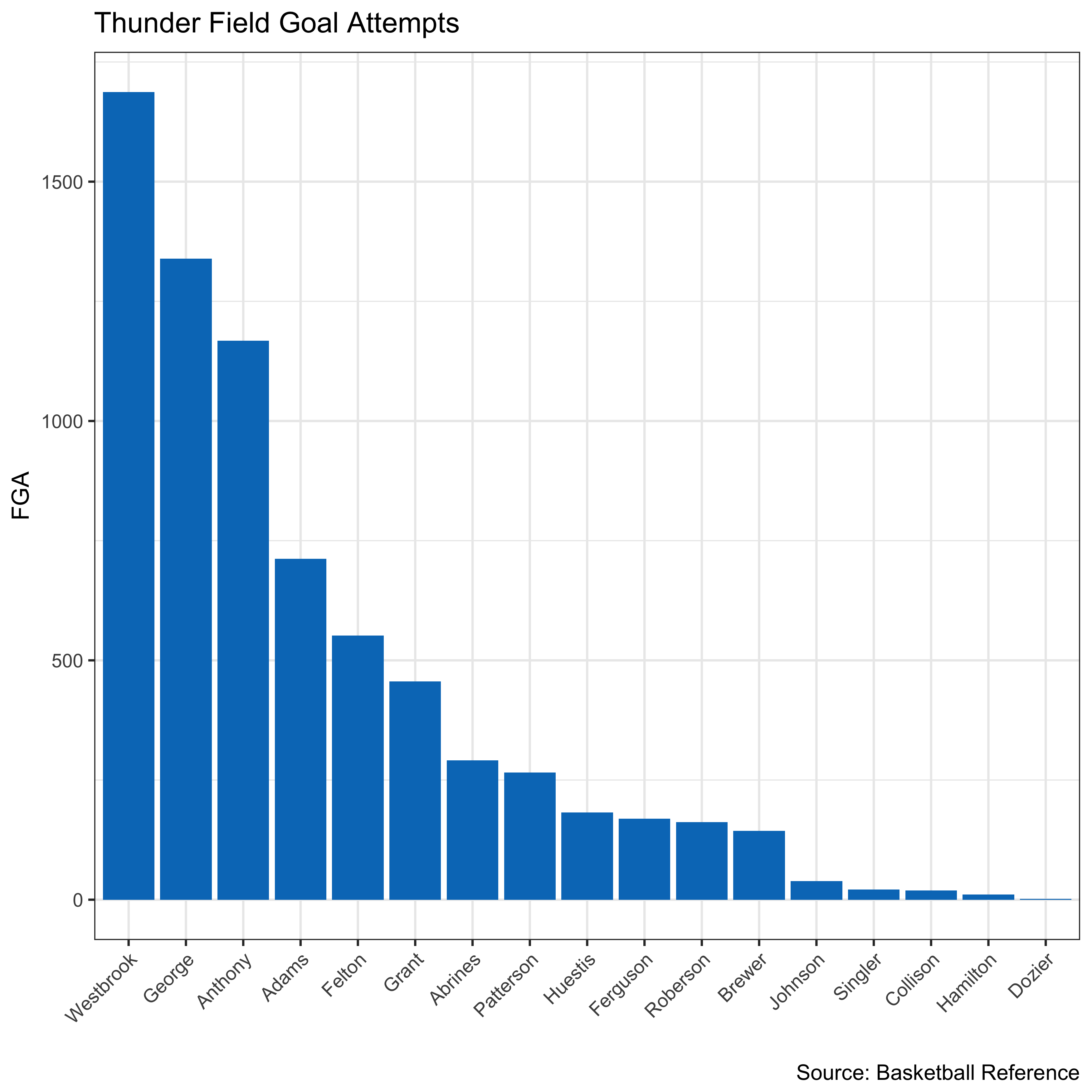
For an example of their abnormal shot distribution, we need not look further than the box score from their last game of the season, a game in which Russell Westbrook hoisted 43 shots.
